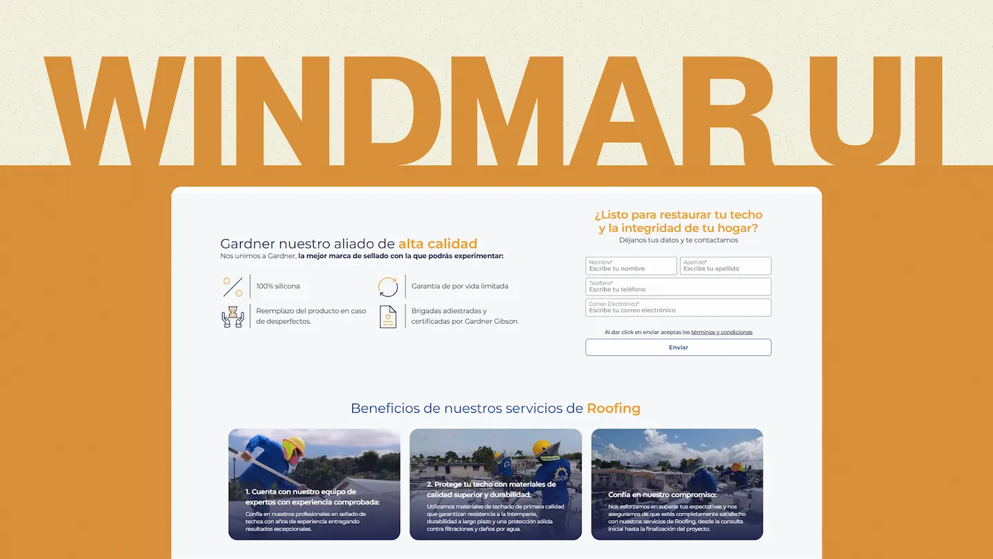
Windmar UI
A component library built from scratch to unify WindMar Home’s visual identity across all its digital products. Natively compatible with React and Astro, published as a private npm package.
Team
My role: Lead Developer — responsible for the architecture, development, and implementation of the library, prioritizing performance, versatility, and accessibility. I also contributed to UX/UI decisions.
Juan David Herrera — UX/UI Designer
Context and problem
When I joined WindMar, I noticed there was no defined design system. Pages had no visual consistency between them: inputs varied in style even within the same landing page, buttons changed shape and color without clear criteria, and every new project started from scratch in terms of styling.
At first this didn’t seem like a critical issue, but as projects grew it became clear that a consistent visual identity was needed to build trust and comfort for the end user.
The solution: I proposed developing a UI component library that would be 100% compatible with both existing and future projects. After evaluating the company’s tech stack, we defined React and Astro as the two main technologies it would be built on.
Technical challenges
Publishing as a private npm package
I had never created a component library or published an npm package before. However, publishing it as a private package was an essential requirement: the number and scale of projects we managed made it unfeasible to copy and paste components between repositories.
Dual compatibility: React and Astro
The library needed to work natively in both environments. If a project was built in Astro, the components had to work without needing to install the React integration for Astro. Additionally, everything had to be compatible with Tailwind CSS 4 and TypeScript.
Centralized documentation
We needed a single site to document all components, their variants, and their usage. The most popular option was Storybook, but at the time of development it didn’t have native support for Astro. For this reason, we chose Astro Starlight along with its React integration, which allowed us to document both versions of the components in one place.
Development process
Research and references
Before writing any code, I studied the architecture of several open source React libraries. The most influential one was Hero UI (Next UI). By analyzing their repository, I discovered patterns and behaviors that I would have otherwise taken much longer to identify as necessary.
A key example was component polymorphism: a button is visually recognizable as such, but it doesn’t always need to render as a <button> tag. It could be an <a> acting as a link, or even a fully custom element where the developer just wants to reuse the styling. Every component in the library had to support this flexibility to adapt to any use case.
Methodology and planning
We adopted Atomic Design as our design methodology, which allowed us to build the library in a modular and scalable way. Juan David was in charge of defining the visual identity and designing each component.
For development, I had an approximate timeline of two months. I organized the work on a task board where each component had its own card with the following criteria:
- Visual variants (sizes, colors, states)
- Interactions (hover, focus, disabled)
- React Hook Form compatibility
- Testing
- Extensible architecture (easy to add new components)
- Changelog per version
React development
Although we initially considered using an open source library as a base, we decided to build everything from scratch to have full control and tailor it exactly to our needs.
To manage the style variants of each component, we used Tailwind Variants, created by the same Hero UI team. This tool greatly simplified the creation and manipulation of variants, keeping the code clean and predictable.
Astro development
The component library ecosystem for Astro is considerably smaller than React’s, which made this part of the development more challenging. The goal was to achieve functional parity with the React version.
For example, in React the Accordion component is controlled by an AccordionGroup that manages which element is open and which is closed, with animations handled by GSAP. To replicate this same behavior in Astro without depending on React, we wrote vanilla JavaScript scripts that managed state and animations natively.
Result
After several weeks of development and testing in controlled environments, the library was completed and implemented in the redesign of WindMar Home’s main website.
Concrete impact:
- Visual consistency across all of the company’s digital products
- Reduced design time, as designers now work directly with the library’s components
- Reduced development time, by eliminating the need to create styles from scratch for each project
- Scalability, with an architecture that allows adding new components easily
Conclusion
This project was one of the most significant experiences of my career. Facing a challenge I had never tackled before — from designing a library’s architecture to publishing it as an npm package — gave me the confidence to take on increasingly complex technical challenges.
